Worksheets for Dyslexic & ADHD Kids: A Design Checklist
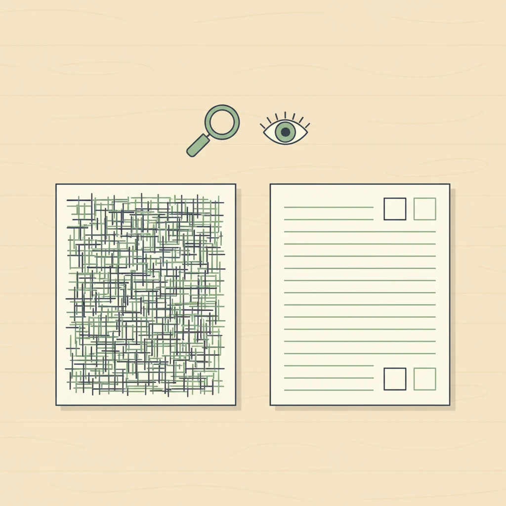
Most printable worksheets are designed for a hypothetical "average" reader who doesn't really exist — and the kids who need printables to work hardest for them are the ones the design fails most. If your child has dyslexia, ADHD, or any combination of learning differences, the difference between a worksheet that helps and one that quietly punishes them comes down to seven design choices. None of them are visible on the thumbnail. All of them are visible if you know what to look at.
This post is for the parent who has watched a perfectly capable kid melt down at a sheet of math problems and wondered which part of the page broke them. Almost always it's not the math. It's the typography, the density, the instruction wording, and the way the page is laid out — design choices that competent readers can power through but that compound rapidly when working memory or visual processing is already taxed. Worksheets aren't neutral. They have a teaching philosophy baked into their layout, and most of that philosophy assumes a reader who doesn't need the design to help them.
The good news: the design choices that make a worksheet work for a dyslexic or ADHD kid don't hurt anyone else. A clean page with generous spacing, plain-language instructions, and a predictable structure is a better worksheet for every kid in the family. The checklist below is what we use ourselves when curating maps, sight-word sets, and math practice for Printable Scholar — drawn from International Dyslexia Association design guidance, Reading Rockets accessibility principles, and the developmentally-appropriate-practice framework from NAEYC.
1. Font choice and size
Look for: A clean sans-serif font (think Open Sans, Verdana, Tahoma, Comic Sans, Lexend, or fonts labeled as dyslexia-friendly such as OpenDyslexic). Body text at 14pt or larger for elementary; 16pt+ is better for emergent readers.
Avoid: Tight, narrow serif fonts (Times New Roman set small), decorative chalkboard or script fonts on instructional content, and worksheets where the font shrinks to fit more problems on a page. If the body text is the same size as the footer, that's a signal the sheet was designed for printer-cartridge economy, not for a reader.
The serif-versus-sans-serif debate has more nuance than the typography internet suggests, but the practical guidance is stable: simpler letterforms with clear visual differentiation between letters that confuse dyslexic readers (b/d, p/q, n/u) reduce decoding load. Comic Sans gets mocked, but it's mocked because it's everywhere, and it's everywhere partly because it works for kids who need letter-form clarity. You don't need a specialized "dyslexia font" — you need a font where the letters don't fight each other.
The bigger lever is size. A 10pt worksheet asks a struggling reader to do both the decoding work and the visual-tracking work in a smaller-than-comfortable space. Bumping to 14pt with the same content costs nothing and removes one whole class of friction.
2. Line spacing and letter spacing
Look for: Generous line spacing on text — 1.5x line height is the floor; 1.75x or 2x is better for emergent readers. Between problems on math worksheets, you want enough white space that each problem feels like its own object, not part of a wall.
Avoid: Single-spaced reading passages, worksheets where the next-line baseline sits directly under the previous line's descenders, and math sheets where rows of problems run flush against each other. Letters and numbers should never visually merge with their neighbors.
This is the single highest-leverage check for dyslexic readers. The British Dyslexia Association and IDA both recommend 1.5x line height or higher as a baseline accessibility standard. The cost of compliance is a longer page; the benefit is that the reader's eye stops losing its place mid-line. For ADHD kids, generous spacing also reduces the "wall of text" effect that triggers task avoidance before any actual reading has happened.
3. Instructions in plain language, one step at a time
Look for: A single instruction at the top of the page, written in plain present-tense imperative ("Color the long-A words red. Color the short-A words blue."). If there are multiple steps, they're numbered, on separate lines, and broken with white space.
Avoid: Long compound instructions ("Read each sentence below and decide whether the underlined word is a noun or a verb, then circle your answer and write the word in the correct column on the back of the page"). Instructions buried inside body text. Instructions that assume the kid already knows what the worksheet is for.
For a kid with working-memory constraints — which describes most ADHD profiles — every clause in an instruction is another item to hold in mind while reading the next clause. By the time they reach the worksheet's actual content, the instruction is gone. They either guess what to do or freeze. Neither of those is the academic skill the worksheet was supposed to assess.
A useful test: read the instruction aloud once, then ask your child to repeat it back in their own words. If they can't, the instruction is too dense for the page, regardless of whether your child "should" be able to handle it.
4. Page density and white space
Look for: Worksheets where roughly 40–60% of the page is white space. Problems are well-separated. Margins are generous. There's room for the kid to write large, cross things out, and not feel like they're crowding the next problem.
Avoid: "Value pack" worksheets that cram 40 math problems onto a page. Pages where there's no margin and the answer line touches the next problem. Anything that looks like it was optimized to reduce printing cost rather than to be filled in by a human.
This is a structural design choice that creators make at the layout stage and rarely revisit. A 12-problem sheet with breathing room is almost always a better learning experience than a 40-problem sheet with the same problems. If your kid will only stay engaged through 12, the other 28 weren't going to teach them anything anyway — they were going to teach them that worksheets feel bad.
The corollary: don't grade a worksheet by problem count. Quality of attention on 10 well-spaced problems beats quality of avoidance on 40 crammed ones.
5. Visual structure and predictable layout
Look for: Consistent layout from one page to the next within a packet. Problems numbered in a clear sequence. Answer locations always in the same place (always to the right of the problem, or always on a single line under it). A clear visual rhythm the eye can predict.
Avoid: Worksheets that switch layout mid-page (problems numbered 1–5 vertical, then 6–10 horizontal). Answer locations that move around. Pages that mix problem types (matching, fill-in, multiple choice) without visual separation between sections.
Predictable structure lets a reader's executive function rest. Each time the layout changes, the kid has to re-orient — figure out where to look, where to write, what the new problem type is asking. For an ADHD kid, those orienting transitions are exactly the moments attention gets lost. A worksheet that asks for ten transitions in a single page asks for ten chances to lose the thread.
This is also why a series of related worksheets that share a visual template often outperforms a single "comprehensive" sheet that tries to cover everything at once. We use the same approach in our decodable readers — every book in the sequence shares the same page layout so the reader's attention budget can go entirely toward decoding, not toward re-learning the format.
6. Color, contrast, and visual noise
Look for: High contrast between text and background — pure black on pure white is fine; dark gray on cream is fine. If color is used, it's functional (color-coding categories, highlighting target words), not decorative. Backgrounds are clean.
Avoid: Patterned backgrounds, watermarks behind text, faux notebook-paper textures with lines that fight the worksheet's own lines, decorative borders that compete with the content, and color choices that put medium-saturation text on a medium-saturation background (low contrast). Cartoony characters in every corner of the page count as visual noise.
Visual noise is the design equivalent of a fan running while you're trying to listen. The reader can power through it, but it eats attention budget that should be going toward the actual task. For dyslexic kids, low-contrast text on a busy background can make individual words harder to resolve. For ADHD kids, every decorative element is something to look at instead of the problem.
If a worksheet looks "fun" because every margin has a cartoon character, that's usually a worksheet to skip. Real fun comes from succeeding at the task. Decorative noise often substitutes for actual engagement, and it disproportionately costs the kids whose attention budget was already smallest.
7. Chunking — how the work is broken into pieces
Look for: Work broken into clear chunks of three to six problems, with a visual break between chunks. A sense of "this section, then this section, then this section." Natural stopping points the kid can see coming.
Avoid: Twenty problems in a single undifferentiated block. Worksheets that present the entire workload as one wall, with no visible "I'm a third of the way through" milestone. Pages that demand the reader process the whole thing before knowing how long it will take.
For a kid who struggles with task initiation — which describes a huge slice of ADHD homeschoolers — being able to see the chunking is itself half the work. "Five problems, then a break, then five more, then a break" is a completable task. "Twenty problems, go" is a task that will never get started.
The good worksheets we've found break work into visual chunks the kid can point to. Some use horizontal rules between sections; some use mini-headers ("Set 1," "Set 2"); some just use generous white space. The mechanism matters less than the fact that the chunks exist on the page.
The 30-second skim
The full checklist is what to apply when you're vetting a new source or building a custom packet. For everyday "should I print this?" decisions, the skim version is:
- Hold the page at arm's length. If it reads as a wall of dark — dense, crowded, no visible structure — it's going to feel that way to your kid too, only more so. Skip.
- Read the instruction once. If you have to read it twice to understand what's being asked, your kid will read it five times. Skip.
- Count the problems on the page. If there are more than 15 on an elementary worksheet, the sheet was designed to fill a printer cartridge, not a learning session. Use the first 10 and ignore the rest, or find a less crowded sheet.
Three checks, thirty seconds. They'll catch the worst 80% of mismatches without needing to think hard about typography or layout principles.
Where this fits in a homeschool day
A design-accessible worksheet is necessary but not sufficient. It still has to land at the right point in a sequence — the right phonics stage, the right math skill, the right amount of new versus consolidating practice. The methodology page walks through how we sequence the Science of Reading content, and the planner kit is what we use to keep that sequencing legible week to week. For phonics specifically, our decodable readers and sight word sets are built with the design principles above already applied — generous spacing, clean sans-serif, plain-language instructions, predictable structure across the sequence.
If you're vetting a new source rather than printing from our library, the companion piece to this post is How to Vet a Free Homeschool Printable — broader quality checks that pair with this one. And if your printable pile has gotten ahead of your printable system, the 4-binder organization system is what we use to keep packets findable when you need them.
One last note on "should they have to deal with this?"
A reasonable objection to all of this: the world isn't going to redesign every standardized test to be accessible. Won't your kid need to handle dense, badly-designed pages eventually? Yes, eventually. But the developmental sequence matters. A reader who has built fluency on accessible materials can be progressively introduced to denser layouts without their reading skill being the obstacle. A reader who has been fighting the page since first grade often quits before fluency is built. The accessible-design phase isn't lowering the bar; it's removing the wrong barriers so the right ones — the actual cognitive skills the worksheet is supposed to teach — can be the thing your kid is working on.
The compete-set platforms that publish worksheets at scale rarely apply this filter. They're optimizing for volume and breadth, not for the kid whose attention and decoding budget is tighter than average. That's not a moral failure; it's just the structure of a marketplace. It does mean that for parents of neurodivergent kids, the work of curation falls on you. The checklist above is what we apply ourselves — and what you can apply to anything you find anywhere, including printables from this site.
Looking for ready-to-print materials? Browse all our free phonics worksheets, decodable readers and printable maps — every sheet built with the design principles above already applied.
References cited in this post: International Dyslexia Association (dyslexia design guidance), Reading Rockets (Science of Reading and accessibility), NAEYC (developmentally-appropriate practice). General accessibility principles aligned with British Dyslexia Association style-guide recommendations for line height and font selection.